Why consistency is unusually important for this brand
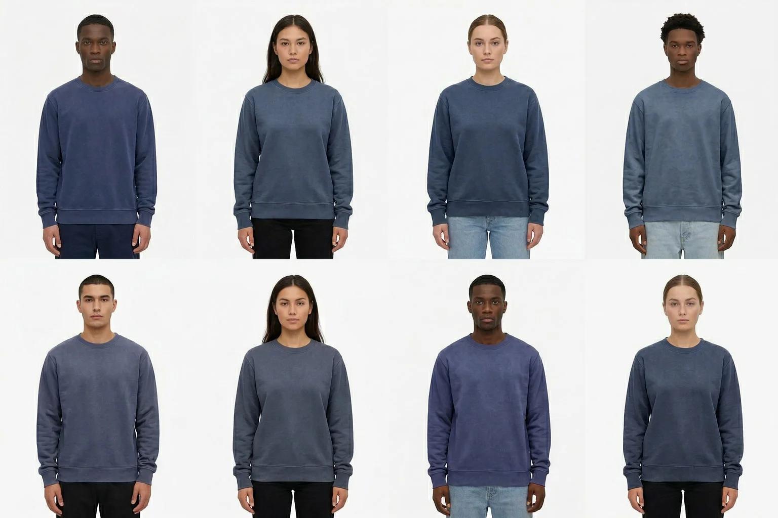
Colorful Standard does not sell fashion in the usual seasonal sense. The brand's public positioning emphasizes organic cotton, recycled merino, ethical production in Portugal, and a non-seasonal approach to essentials. In practice, that means the business relies on repeatable product families, stable silhouettes, and color depth more than it relies on constant shape reinvention. When customers shop the brand, they are often comparing tone, fabric, and fit across multiple versions of what is fundamentally a trusted staple.
That makes visual consistency more than an aesthetic preference. It is a core part of product comprehension. If lighting changes too much between launches, if color rendering feels unstable, or if body posture and framing drift from one collection to the next, customers lose a clear point of comparison. The shopping experience becomes noisier than the product proposition.
For a brand built around essentials, that noise is expensive. It weakens the feeling that every sweatshirt, tee, hoodie, and knit belongs to one coherent system. It also increases the amount of work required from the shopper, who has to mentally normalize differences in imagery before making a purchase decision. That is the exact problem the preserve-consistency use case is meant to solve.
The operational challenge behind a consistent brand world
Consistency sounds simple until a catalog starts to scale. A business like Colorful Standard has to manage multiple fabrics, a large range of colors, core products that remain live for long periods, and replenishment cycles that do not always line up with the original imagery schedule. Even if the creative team has strong guidelines, execution drifts over time. Different shoots introduce slightly different lens choices, grading, pose energy, or garment styling. Retouching standards evolve. A hero style is replenished months later and the new assets do not land in exactly the same visual register as the originals.
The problem compounds when color is central to the brand. Shoppers are not only choosing a silhouette; they are often choosing among many shades of the same essential. If the imagery feels inconsistent, customers may not trust the comparison. That creates more hesitation, more support questions, and more dependence on off-site validation.
In this illustrative scenario, UNSTILL would not be used to invent a new creative direction for Colorful Standard. It would be used to preserve a strict one. The point would be to turn the brand's existing visual logic into a reproducible production framework that holds across categories and across time.
How UNSTILL would fit into the process
The rollout would begin with the creative team documenting what consistency actually means in measurable terms. For Colorful Standard, that would likely include neutralized light, reliable skin and fabric rendering, stable camera distance, standardized posture, and a disciplined approach to background and shadow. Because the brand is built on essentials rather than spectacle, the guardrails would need to be narrow.
Once that system was defined, UNSTILL could become the continuity layer for several common catalog scenarios. The first would be replenishment content, where an existing hero style needs fresh imagery without introducing noticeable visual drift. The second would be catalog expansion, where a product family gains additional colors or related items and the assets need to match the rest of the range. The third would be cleanup work for legacy PDPs that no longer sit comfortably beside newer launches.
Instead of treating those scenarios as separate production problems, the team could treat them as one consistency problem. UNSTILL would make that practical by generating images inside a stable visual framework rather than requiring every update to start from a blank production slate.
The merchandising advantage
For Colorful Standard, a consistent image library would make the entire catalog easier to navigate. A shopper browsing colorways or comparing wardrobe basics could move across PDPs without feeling the handoff between different production eras. That is a subtle but important advantage. When the imagery behaves predictably, the product signal comes through more clearly.
This would also help merchandising tell a stronger system story. Essentials brands are at their best when shoppers buy in sets, layers, or repeat fits. If the visuals across those products are stable, it becomes easier to build collection pages, bundles, and editorial modules that feel unified. One launch does not interrupt the logic of another. The catalog reads as a complete environment rather than a patchwork of isolated shoots.
That clarity matters at every level of the funnel. On-site, it improves browse confidence. In paid media, it makes remarketing feel more coherent. In email, it helps product stories travel from one send to the next without visual fatigue. Consistency is not only a creative virtue; it is a multiplier on every downstream merchandising action.
Where the time savings would come from
The most obvious savings would show up in post-production. When imagery starts from a more repeatable base, the need for corrective retouching goes down. Teams spend less time normalizing background tone, light falloff, shadow behavior, and body position from one image set to another. That does not eliminate creative review, but it shifts review from repair toward refinement.
The second savings would come from decision speed. When the ecommerce and merchandising teams trust that new imagery will enter the catalog in a controlled way, they can move faster on replenishment and launch updates. They do not have to re-litigate the creative standard every time a core product comes back into focus.
The third savings would come from asset reuse. A color-rich essentials brand constantly needs combinations: homepage features, collection grids, category storytelling, launch emails, and paid social variations. If the base catalog is consistent, those secondary outputs become easier to assemble. The content library becomes modular instead of fragile.
A practical rollout plan
The smartest starting point would likely be one dense product family. That might be fleece, classic tees, or another area where Colorful Standard carries many colors in familiar shapes. By applying UNSTILL to a single family first, the team could test consistency at the point where the problem is most visible. If the system works there, it is likely to transfer elsewhere.
From that test, the team could define thresholds. Which visual variables are allowed to move? How much pose variation is acceptable? What makes a generated asset feel unmistakably in-system? Those rules could then travel into replenishment, new color introductions, and legacy asset harmonization.
The team could also establish metrics that reflect the brand's needs. Rather than focusing only on top-line conversion, Colorful Standard would likely care about image interaction, dwell time on category pages, fewer support questions about color mismatch, and a smoother path from browse to multi-item purchase. Those are the signals that show whether consistency is helping customers shop with more confidence.
The illustrative outcome
In this scenario, the first result would be a more disciplined catalog surface. Products created months apart would feel visually synchronized. New additions would no longer announce themselves as coming from a different production moment. Returning customers would experience the same brand world whether they were shopping a long-running staple or a recent launch.
The second result would be higher operational leverage. The team could allocate live-shoot resources where they matter most, then use UNSTILL to preserve the integrity of the broader visual system. That reduces the temptation to overspend simply to maintain baseline consistency.
The third result would be stronger customer trust. A essentials-driven brand asks shoppers to come back repeatedly. That only works when the experience feels dependable. Visual consistency supports that dependability by making products easier to evaluate and the catalog easier to navigate.
Why UNSTILL is a good fit here
Many AI-image use cases emphasize novelty, but Colorful Standard does not need novelty as much as it needs control. The brand's value lies in the discipline of repeatable essentials: color, quality, and calm execution. UNSTILL fits that need because it can be positioned as a continuity tool rather than an experimentation layer.
That distinction is important. A business built on core wardrobe pieces does not benefit from content volatility. It benefits from a system that lets the catalog grow without fragmenting. In this illustrative case study, UNSTILL would serve exactly that role. It would help Colorful Standard keep its image language steady while the assortment evolves, the product matrix expands, and the content operation has to move faster than traditional production alone can comfortably support.
For a brand whose promise is consistency in product and principle, preserving consistency in imagery is not cosmetic. It is structural. UNSTILL would make that structure easier to maintain.