Background choice is one of the easiest ways to make a clothing image feel more polished. It is also one of the easiest ways to make a product harder to shop. That tension is why background decisions deserve more respect than they usually get. Teams often treat background as decoration. In ecommerce, it is closer to framing. It changes what the customer notices first, how clearly the garment reads, and whether the image fits the job it is supposed to do.
The best clothing photo background is not the one with the most personality. It is the one that helps the product sell without stealing attention from it.
That answer changes depending on the channel, the garment, and the role of the image. A PDP hero, a collection grid card, a paid social image, and a campaign tile may each need something different. The mistake is assuming they all need drama.
Why simple backgrounds win more often than people expect
Simple backgrounds are powerful because they remove friction. They let the shopper focus on shape, texture, color, and fit. They also age well. A clean backdrop that feels polished today will usually still feel usable next season. That is not always true of heavily styled scenes or trendy visual environments.
This is especially important on product pages, where clarity matters more than mood. A busy background can make the image feel creative, but it can also make it harder to compare garments, harder to trust color, and harder to scan the catalog quickly. When customers are shopping, subtle friction matters.
That is why the safest default for ecommerce remains a clean, quiet setting. If your team is reworking the full gallery rather than a single frame, how to build a fashion PDP image sequence that helps shoppers decide faster helps define where the quietest background should sit in the sequence.
Background is part of merchandising
A background does more than set a tone. It influences how the product is merchandised. A minimalist backdrop makes the item feel direct and easy to assess. A warm scene can make the same garment feel more lifestyle driven. A bright, airy environment can soften the perception of a product, while a darker setting can make it feel more formal or dramatic.
None of these outcomes is inherently better. The point is that background changes the selling frame. If a team makes that decision casually, the result often feels random. If it makes it deliberately, the background becomes part of a coherent content system.
This is why brands should stop asking only whether a background looks attractive and start asking what kind of shopping behavior it encourages.
The best background for product detail pages
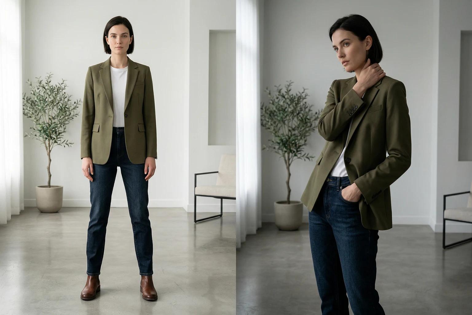
For most apparel products, the best background for a PDP image is one that keeps the garment legible and confident. It does not need to be sterile. It does need to stay out of the way. This usually means a neutral backdrop or a restrained environment with soft visual information and enough separation from the garment.
The goal is simple. A shopper should understand the product immediately. If the background is more memorable than the cut of the dress or the line of the jacket, the balance is off. The image may still be usable somewhere else, but it is not doing the clean work a product page often needs.
This is one reason many brands keep a simple background as their default and layer in more expressive scenes only where the channel benefits.
When scene backgrounds make sense
Scene backgrounds can be extremely useful, but only when they are chosen for a reason. Launch pages, email hero banners, paid social, and editorial modules can all benefit from more atmosphere. A scene can add mood, context, and a stronger sense of story. It can also help a product feel more alive when the channel rewards emotional reaction.
The key is control. A scene should extend the brand world, not replace it. If the product is refined and understated, the background should not suddenly become loud and theatrical. If the brand has an outdoors rhythm, a totally generic luxury interior may feel detached from the product story.
The strongest scene backgrounds feel inevitable once you see them. They support the garment without announcing themselves too aggressively.
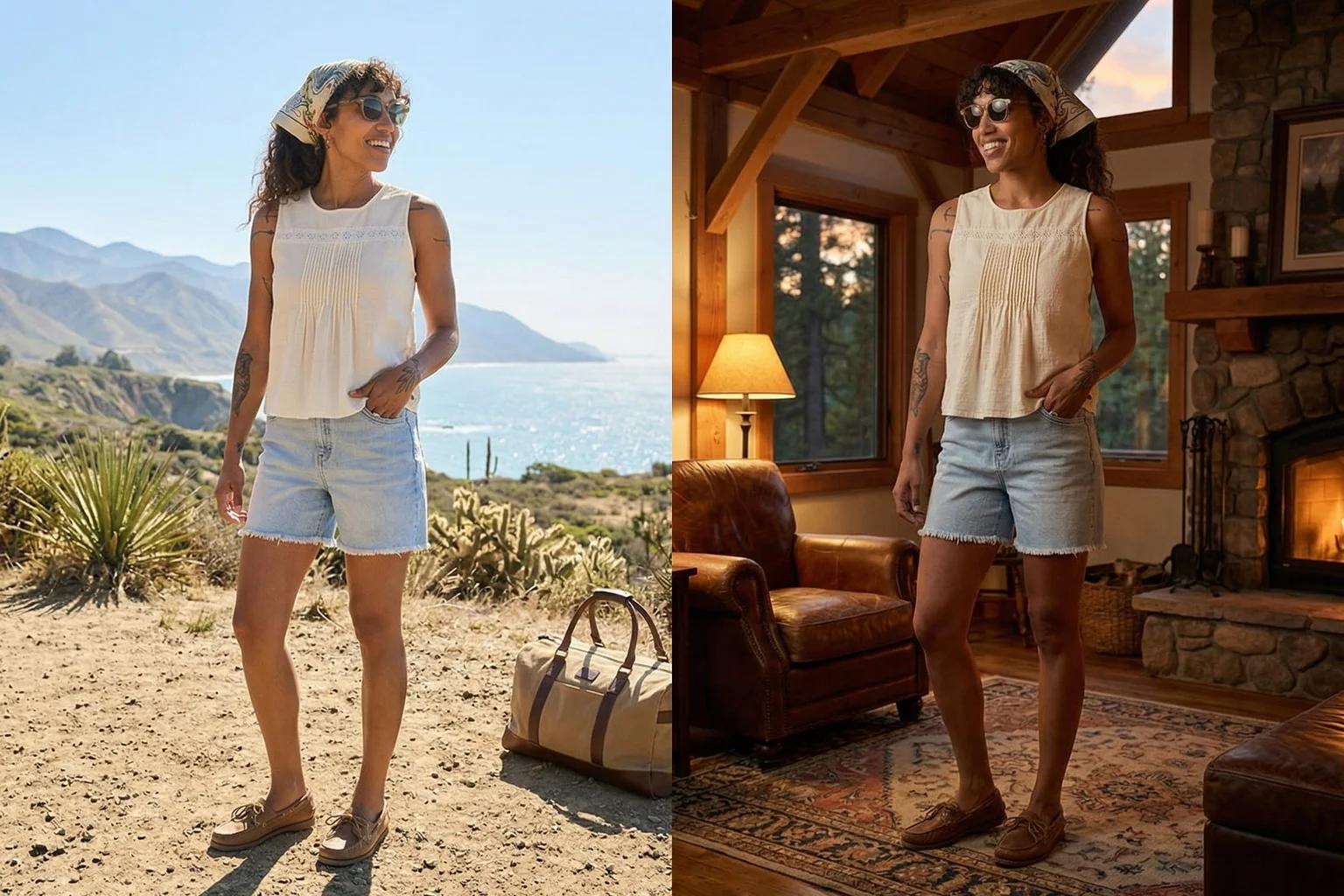
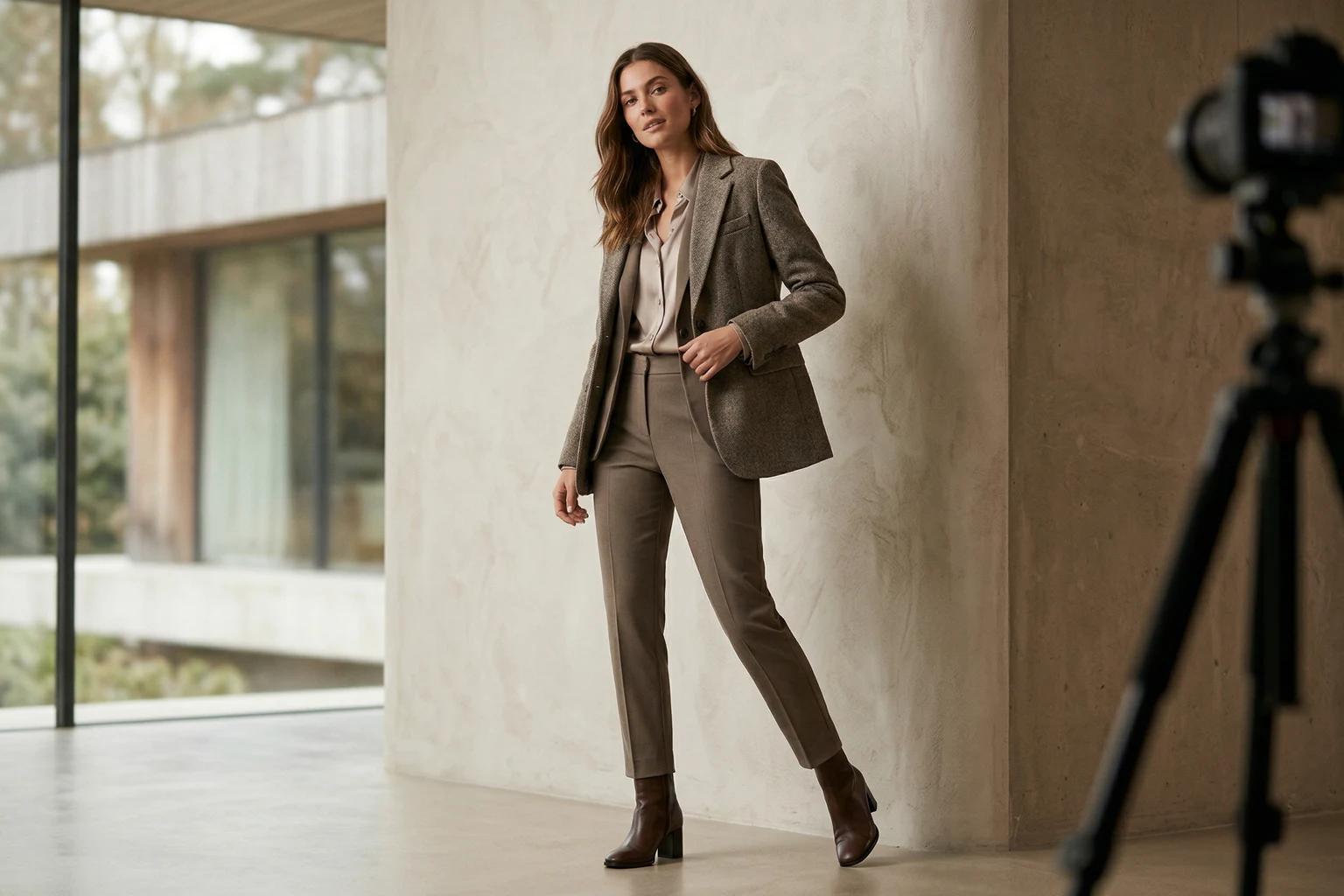
Original background can be more valuable than replacement
In some cases, the original environment is already doing the job well. This is especially true with certain on model images where the location is clean, consistent with the brand, and useful to the product. In that situation, forcing a background replacement can actually remove value. The image may become more generic even while becoming more polished.
This is a good reminder that background work should start from purpose, not from the assumption that change is always improvement. Sometimes the best move is to keep the original setting and adjust another variable instead, such as model direction or crop.
Match the background to garment complexity
The more complex the garment, the simpler the background often needs to be. If a piece already has rich print, texture, ruffle, layering, or unusual structure, then the environment should give it room. A quiet backdrop lets the design speak. On the other hand, a very simple garment can sometimes carry slightly more environmental character without becoming confusing.
This does not mean basics always need scene work or complex garments always need plain settings. It means the total amount of visual information in the frame should stay balanced. The product and the background should not be competing for the same attention.
This is one of the most useful tests during review. If you squint and the frame feels noisy, the background may be doing too much.
Match the background to the channel
Every background decision should begin with where the image will be seen.
Collection pages usually reward cleanliness because the shopper is scanning quickly.
Product detail pages reward clarity and trust because the shopper is evaluating.
Email and paid social can support a bit more atmosphere because they are often trying to attract attention before a click.
Editorial and campaign placements can carry the most scene character because they are helping tell a broader story.
Once brands really accept that, background choice gets easier. The question shifts from what looks nicest to what works best here.
A practical way to test background direction
If your team is unsure whether a product needs a clean backdrop or a scene, do not debate it endlessly. Run a controlled comparison. Keep the garment, model, and pose stable. Change only the background direction. Then review the result against the intended use. Which version makes the product easier to understand. Which one feels more persuasive. Which one fits the rest of the catalog or campaign better.
This kind of narrow test creates useful learning because it isolates the variable. A lot of background confusion comes from changing too many things at once.
Common background mistakes in apparel imagery
The first common mistake is choosing a scene because it looks expensive. Expensive looking is not the same as effective.
The second is choosing a backdrop so plain that the brand loses all character. Clean is good. Empty is not always good.
The third is using the same background logic for every channel. A product grid, an email, and a paid social ad often need different levels of environmental energy.
The fourth is ignoring product color. Some backgrounds make certain garments pop. Others flatten them or make color trust harder.
The fifth is forgetting how the image will sit beside other assets. One beautiful background can still be the wrong choice if it breaks the coherence of the collection or campaign.
Build a small background system
Most brands do not need endless background variety. They need a few dependable lanes.
One lane can be a clean backdrop for core commerce use.
Another lane can be a refined scene for launch and social.
A third lane can preserve the original environment where it already works.
That small system is usually enough to create variety without creating inconsistency. It also makes decisions faster because the team is not starting from zero every time a new product appears.
If you are building this inside UNSTILL, the selection guide is the best reference for thinking about scene versus backdrop logic across real projects.
The practical conclusion
Clothing photo background ideas become useful only when they are tied to the job of the image. A clean backdrop helps products feel clear and trustworthy. A scene can add atmosphere and energy when the channel can use it. The original environment can still be the best option when it already supports the product well.
The background is not a garnish. It is part of the selling structure. When brands treat it that way, they stop choosing environments for novelty and start choosing them for clarity, persuasion, and consistency. That is when the image starts helping the product instead of performing around it. If you want to test those lanes on real products, use Unstill to compare one clean backdrop and one scene-based version against the same garment before you scale the choice.