One style in six colors can quietly turn into a production problem.
The merchant wants the hero shade fully on-model. Paid wants the launch color. The ecommerce team worries that the light colorway needs a detail shot because texture disappears. Meanwhile, the slower-moving variants still need to look credible on the product page. If you treat every color option like it needs identical photography, the asset list grows faster than the business value does.
The better approach is to decide what each colorway needs to do. Some variants need a full visual story. Some need one confirming frame. Some only need clear flat product coverage and an honest swatch handoff. This is where merchandising discipline matters more than raw image volume.
Why color variants become expensive faster than teams expect
Most brands do not overspend on variant imagery because they love excess. They overspend because they do not define the job of each colorway early enough.
When that decision stays fuzzy, the team defaults to one of two bad habits. Either every color gets pushed toward the same level of coverage, which strains budget and slows launch, or one hero color gets all the attention while the rest of the variants feel underexplained once they go live.
Both outcomes create avoidable friction:
- Production gets heavier than the assortment justifies
- Collection pages become visually uneven across colorways
- PDPs rely too heavily on one default image set
- Shoppers click into a selected variant and still cannot tell what is actually different
This is why variant planning should sit closer to merchandising than to pure creative preference. The question is not whether more imagery would be nice. The question is where color specific imagery actually changes the buying decision.
Not every colorway deserves the same on-model coverage
Start by separating the lead colorways from the support colorways.
Usually, a color deserves deeper on-model treatment when at least one of these is true:
- It is the launch color or marketing hero for the style
- It is expected to drive the most traffic or revenue
- The shade changes how fabric, transparency, or texture reads
- The print, wash, or contrast trim makes the product feel materially different
- The color is important for key channels beyond the PDP, such as email, paid, or collection page placement
That logic mirrors the broader prioritization framework behind how to prioritize on-model images across your fashion catalog. The difference here is that you are applying the same thinking inside one style family instead of across the whole assortment.
For example, imagine a satin slip skirt in black, ivory, olive, rust, and a seasonal floral print. Black and ivory may both deserve stronger coverage because sheen and opacity behave differently. The floral print may deserve its own on-model frame because scale and placement matter. Olive and rust may not need the same depth if the silhouette reads consistently and the traffic expectation is lower.
That is a better use of production than pretending all five variants need the exact same image stack.
Build a three-level coverage system for each style
Once the team knows which colors matter most, give each variant a role. A simple three-level system is usually enough.
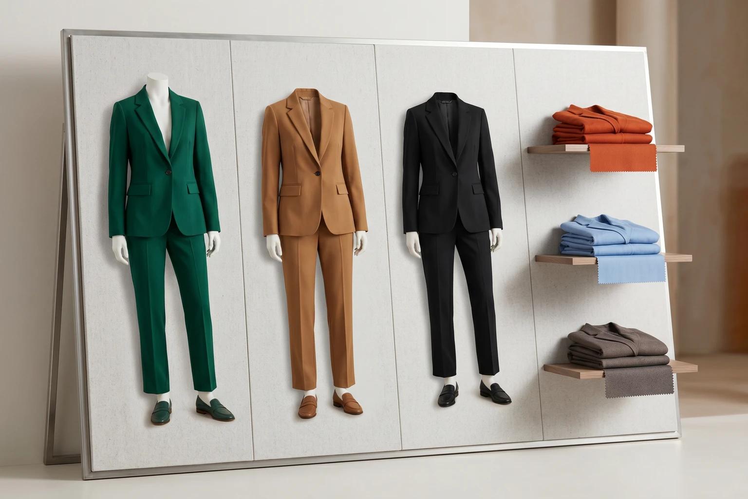
1. Lead colorway
This is the version that carries the strongest commercial weight. Give it the most complete visual sequence.
That usually means:
- A clean hero frame
- At least one alternate on-model image
- Supporting detail or back view coverage when needed
- Asset suitability for launch, browse, and downstream marketing
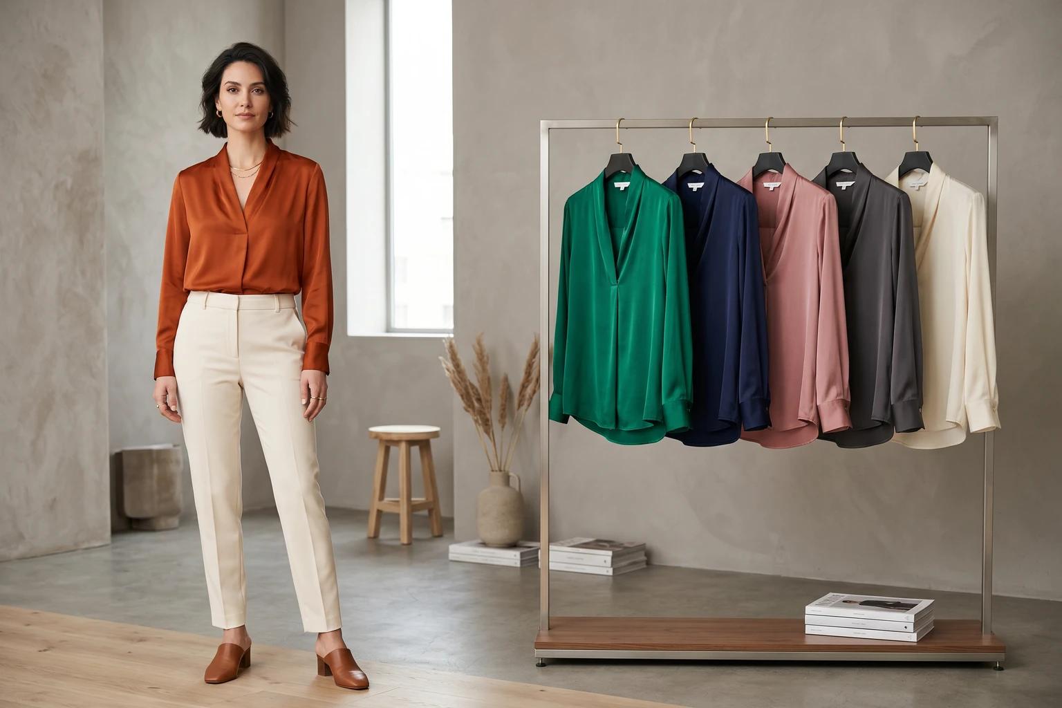
2. Confirming colorway
This color does not need a fully separate gallery, but it does need proof that the product still reads correctly in that shade.
Often one strong on-model frame plus flat product support is enough. The key is confirmation. The customer should be able to see that the color exists on body and that it does not introduce surprises the lead colorway failed to show.
3. Support colorway
These variants can often rely on clean flat product images, swatches, or one shared visual structure as long as the product remains easy to understand.
This is especially true for low-risk basics, replenishment shades, or secondary colors that are not central to launch visibility. If your team already has a strong standard for flat product clarity, how to standardize apparel product images across your catalog without making them look generic is the right companion framework here.
The point is not to shortchange support colors. It is to avoid spending lead-color budget on every variant by default.
Separate browse-grid needs from PDP needs
A lot of variant confusion comes from using one image logic everywhere.
Collection pages and product pages do not ask the same thing from color imagery. Browse is about comparison speed. PDPs are about decision confidence. If you try to solve both with identical coverage rules, you usually end up overproducing one environment and underexplaining the other.
On the collection page, the main job is to keep the assortment easy to scan. That often means choosing the strongest lead colorway image for the card, then making the available color options obvious through swatches or clearly managed alternates. How to choose fashion collection page images that keep shoppers browsing covers that logic in more detail.
On the PDP, the selected color has to feel truthful. Shoppers will tolerate a collection card anchored by one hero color. They are less forgiving when they choose a specific variant and still feel like they are mostly looking at another one.
That does not mean every variant needs a full duplicate gallery. It means the selected variant needs enough direct evidence to support the decision.
This is also why the sequence matters. If the lead colorway carries the full story, the support colors should still plug into a gallery structure that answers the shopper's core questions. How to build a fashion PDP image sequence that helps shoppers decide faster is useful because it defines what those questions usually are.
Watch for the variant mistakes that quietly hurt trust
Color variant imagery often fails in small ways that look acceptable in review, then feel misleading in the live experience.
The most common traps are:
- Using one dark colorway on-model while a much lighter selected variant has different opacity or texture behavior
- Treating prints like simple color swaps when placement, scale, or contrast change the product read
- Mixing backgrounds or crop logic so variants feel like they belong to different product families
- Showing only a swatch for a variant that really needs at least one confirming body frame
- Letting the lead colorway dominate so completely that support colors look unfinished
These are not just aesthetic issues. They change how confidently the customer can evaluate the item. In fashion ecommerce, trust is often lost through omission rather than obvious error.
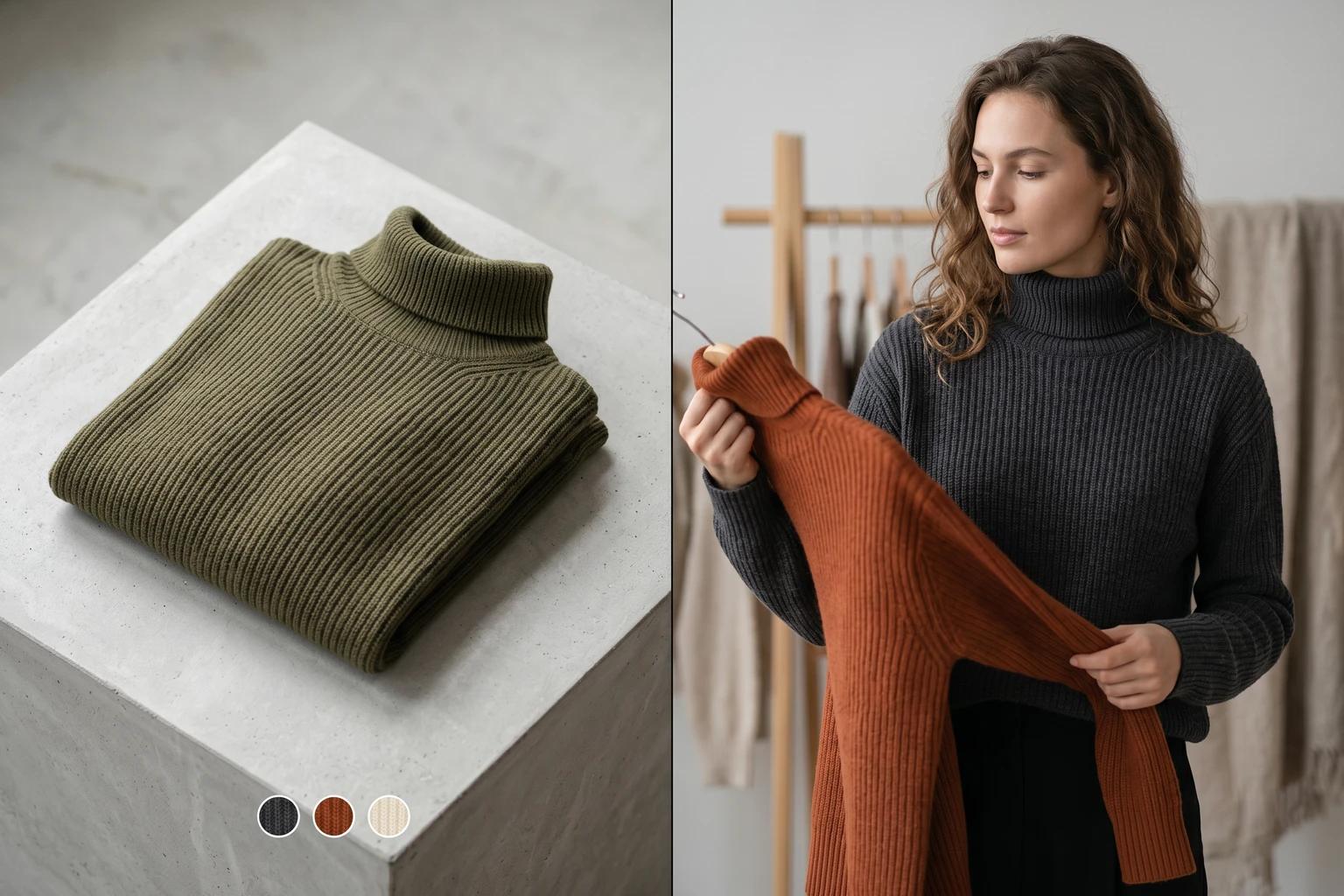
Where AI helps without creating misleading color coverage
This is one of the most practical places to use AI generated fashion visuals, because the operational problem is usually about selective extension rather than total replacement.
If you already have a strong lead colorway and clean flat product assets for the rest, a tool like Unstill can help you extend the coverage where it matters most:
- Create one confirming on-model frame for a priority alternate color
- Turn flat-lays or mannequin shots into body context for selected variants
- Keep pose, crop, and background direction more consistent across the style family
- Build channel-ready versions for the few colorways that need launch support
The important guardrail is accuracy. Use AI to close honest coverage gaps, not to imply product details you cannot support. If the ivory version is sheerer, the imagery should not hide that. If the print placement varies from garment to garment, the visuals should not overstate uniformity. AI is most useful when it makes the existing merchandising system more complete, not more fictional.
Plan the variant system before the sample review gets crowded
The cleanest time to solve this is before the asset scramble starts.
A simple planning pass can save a lot of downstream work:
- Identify the lead colorway for each style based on launch importance and expected demand
- Flag any alternate colors where fabric behavior, print, or visibility changes meaningfully
- Decide which variants need full on-model coverage, one confirming frame, or flat product only
- Align collection page, PDP, email, and paid teams around which colorway will anchor each channel
- Review the final variant set as a merchandising system, not as isolated images
That process makes production easier to scope. It also helps the team say no to unnecessary duplication without leaving important variants unsupported.
The takeaway
Showing more color variants well is not about photographing every option the same way. It is about giving each variant the level of proof it actually needs.
When you do that, launch planning gets cleaner, PDPs feel more trustworthy, and the catalog stays easier to scale. The strongest colorway can still lead. It just does not have to carry the entire style family alone.
If your team is trying to cover more variants without building a heavier photo calendar, use Unstill to extend the colorways that genuinely need body context and keep the rest of the system disciplined.