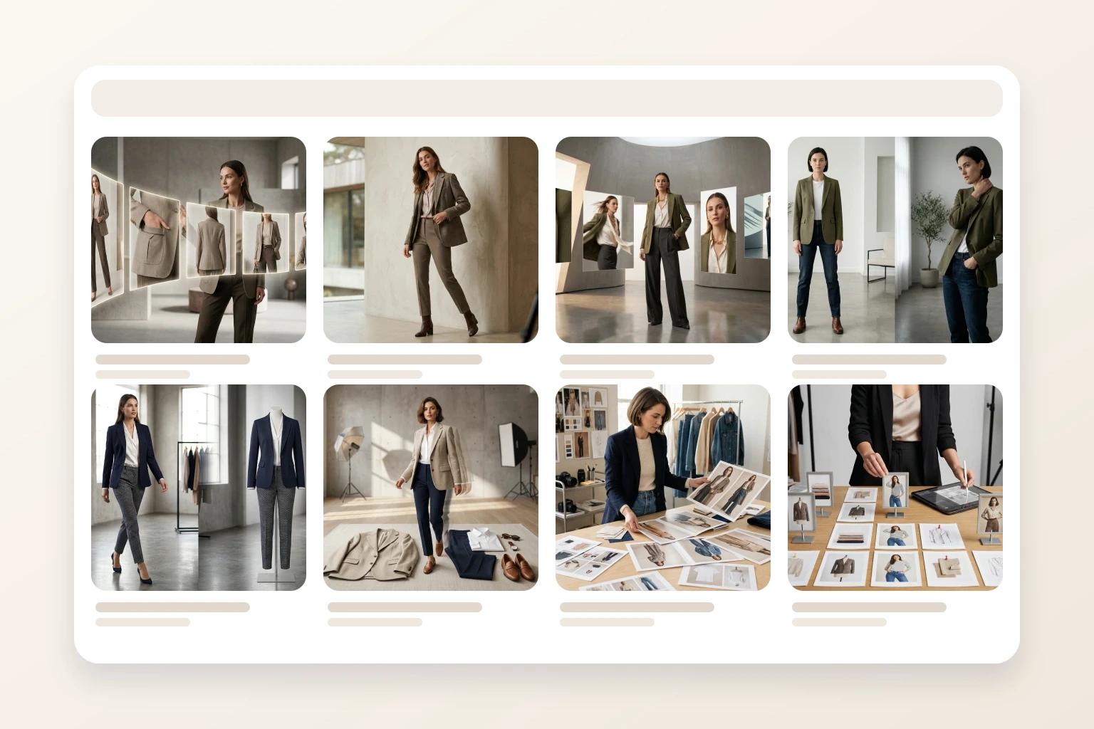
Most fashion teams spend far more time debating PDP images than collection page images. But shoppers usually decide whether to click before they ever reach the product page.
If your browse grid hides silhouette, mixes visual treatments, or jumps randomly between flat product shots and on-model frames, the customer has to work too hard to compare what is on screen. That slows browsing, weakens confidence, and makes the assortment feel less intentional than it actually is.
The goal of a collection page image is not to tell the whole product story. It is to earn the click by making the item easy to scan, compare, and trust in a crowded grid. This guide breaks down how to choose those images more strategically so your collection pages feel sharper and more shoppable.
Collection page images fail when every tile is trying to do a different job
A collection page is a comparison environment.
The shopper is not studying one garment in isolation. They are scanning twelve, twenty-four, or forty-eight products in quick succession. They are looking for shape, category, price-position cues, and enough brand consistency to feel that the assortment belongs together.
That means browse imagery has a different job from PDP imagery. Your product page can slow down and explain detail, texture, and alternate angles. Your collection page needs faster answers.
When browse images underperform, the problems are usually structural:
- One tile is tightly cropped while the next shows a full body
- Some products are on-model while others feel like raw source photography
- Backgrounds shift so much that the eye notices the treatment before the garment
- Similar products are framed so differently that comparison becomes harder
This is why browse logic and catalog consistency belong in the same conversation. If your team is still working through the broader system, catalog consistency without reshooting every SKU is the right foundation.
What a strong collection page image needs to communicate
A good collection page image does three things quickly.
1. It confirms the product category fast
The shopper should know what they are looking at almost immediately. Is it a cropped cardigan, a wide-leg trouser, a slip dress, or a structured blazer?
That sounds obvious, but many grid images lose that clarity through overstyling or inconsistent crops. A browse image does not need to feel dull. It does need to make the product type legible at a glance.
2. It makes silhouette easy to compare
Collection pages are where customers start narrowing options. They compare sleeve volume, hem length, leg shape, neckline, and overall attitude before they commit to a click.
If two similar products are framed with completely different crop logic, the customer is no longer comparing garments. They are comparing photography styles.
3. It supports the brand without overpowering the garment
Browse images should still feel like your brand. But the art direction has to serve the merchandise.
If the background, pose, or styling concept is louder than the product, your grid starts acting like a campaign collage. That can hurt scan speed, especially on mobile. Teams making that call should also review clothing photo background ideas that help conversions because the right background treatment often changes by selling context.
The best collection page images usually feel almost calm. They do not ask for attention with tricks. They make it easy for the shopper to keep moving.
Set browse rules by product type, not by aesthetic preference
A single visual rule for every apparel category usually creates more friction than clarity.
Dresses, denim, knitwear, and outerwear do not ask the image to explain the same things. Your browse standards should reflect that.
Dresses and skirts
Length and shape matter early. If the shopper cannot tell whether the dress is column, bias-cut, mini, or maxi in the grid, the product loses momentum before the PDP ever has a chance.
For browse pages, clean full-length readability usually matters more than a dramatic pose.
Tops and knitwear
The category read is often fast, so proportion and neckline become more important. A slightly tighter crop can work here if it still preserves hem logic and sleeve shape.
Denim and trousers
Leg shape is the browse job. If the crop cuts off too much of the rise or hem, the customer cannot distinguish straight, wide, tapered, or relaxed fits confidently.
Outerwear and tailoring
Structure matters first. The shopper should understand whether the item feels sharp, oversized, cropped, or fluid before they click into closer detail.
The point is not to make every category identical. It is to keep each category internally consistent. If you already have strong PDP rules, your browse rules should feel like a compressed version of that logic, not a separate visual system.
Decide where on-model imagery actually helps the grid
Not every product needs an on-model collection tile. Some do.
The right question is whether body context helps the shopper browse faster. For fit-sensitive products, the answer is often yes. For simpler basics, a clean flat or mannequin-led image may already do enough work.
Use on-model browse coverage where it reduces uncertainty most:
- Dresses where length and drape drive the click
- Trousers where leg shape matters immediately
- Tailored pieces where shoulder line and structure affect appeal
- Launch-critical styles that need stronger first-impression energy
Use simpler product-led imagery where comparison is already easy:
- Carryover basics
- Straightforward tees or tanks
- Support styles lower in the merchandising hierarchy
- Products where color and category are already obvious in a flat presentation
That is why on-model prioritization should start with commercial value, not taste. How to prioritize on-model images across your fashion catalog is useful here because the same tiering logic that improves PDPs also keeps collection grids from becoming visually uneven.
The strongest collection pages usually mix image types on purpose. They do not force on-model treatment everywhere, and they do not leave fit-sensitive products without body context when the browse decision depends on it.
Keep collection pages connected to PDP truth
A browse image should make a promise that the PDP can keep.
If the collection tile feels clean, premium, and easy to understand, the product page should expand that experience with more detail and fit explanation. If the browse image feels dramatic but the PDP feels thin or inconsistent, the click becomes disappointing instead of persuasive.
That is why browse imagery should be reviewed alongside the product page sequence. The first image on the PDP does not need to match the collection tile exactly, but it should feel like the same garment story continued with more clarity. How to build a fashion PDP image sequence that helps shoppers decide faster is the natural next step once your grid logic is stable.
This connection matters operationally too. If one strong source asset needs to support browse, PDP, email, and paid, the adaptation order has to stay disciplined. How to turn one fashion photo into PDP, email, and social assets without making each channel feel generic is a good companion if your team is repurposing the same image base across channels.
Use AI to close browse gaps before launch week
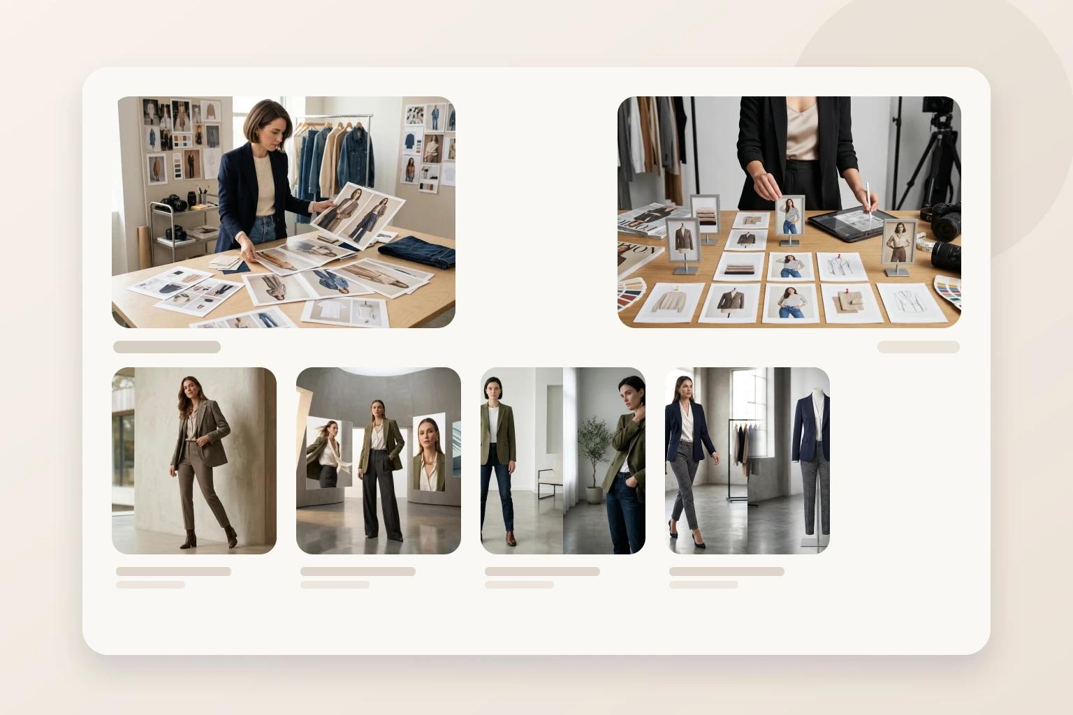
Collection pages often break down because one part of the assortment is ready and another is not.
You may have a polished on-model set for the hero products, flat-lays from development for the supporting styles, and a few older mannequin shots that no longer match the rest of the season. The launch plan gets messy fast.
This is where a workflow inside Unstill becomes practical. Instead of reshooting the entire drop, your team can use existing product assets to create the specific browse images that are missing:
- Turn a flat-lay into an on-model image for a dress that needs silhouette context in the grid
- Update an older mannequin-based image so it fits the current collection treatment
- Swap the background or model presentation when a product feels visually out of step with the rest of the assortment
- Build enough consistent variation to support browse, PDP, and launch channels from the same product source
The important thing is restraint. The job is not to generate more options than the team can merchandize clearly. It is to make the collection page easier to shop before launch pressure turns every asset decision into a compromise.
The takeaway
Strong collection page images do not need to explain everything. They need to make the next decision easy.
When your browse tiles communicate product type, silhouette, and brand consistency quickly, shoppers compare more confidently and move deeper into the assortment with less friction. That gives your PDPs a better starting point and gives your merchandising team a cleaner visual system to scale.
Try this on your next collection launch
Review your next assortment at grid level before you review it SKU by SKU. If some products feel harder to compare or weaker to click, use Unstill to close those browse-stage gaps with cleaner, more consistent fashion imagery.