Catalog inconsistency is one of the most expensive visual problems in fashion ecommerce because it rarely announces itself as a single obvious error. Instead it appears as a thousand small mismatches. One product is lit differently. Another is cropped tighter. Another uses a different background logic. Another has a more editorial pose. None of those choices is fatal on its own, but together they make the brand feel less controlled.
Customers may not describe the issue this way, but they feel it. The site becomes harder to scan, harder to compare, and less trustworthy. Merchandising also becomes harder because products no longer share a stable visual language. Growth teams struggle because the image library feels uneven. Creative teams spend more time correcting inconsistency instead of making deliberate choices.
That is why standardization matters. Not to make the catalog bland, but to make it coherent.
Standardization is not sameness
Many brands resist standardization because they equate it with visual boredom. That is understandable, but it misunderstands the goal. A strong standard does not eliminate creative identity. It protects it. It sets the baseline rules that let the catalog feel intentional while still leaving room for brand character and channel specific variation.
Think of it this way. A brand can have consistent camera logic, lighting discipline, pose families, and background rules without making every image identical. In fact, that consistency often makes the creative moments feel stronger because they stand against a stable system rather than a messy one.
Standardization gives the brand a center of gravity.
Start with the customer experience
The reason to standardize is not internal neatness. It is customer usability. Shoppers compare products quickly. They jump across categories. They scan thumbnail grids. They move from one product page to the next. In that environment, a coherent image system reduces friction. It helps them read the merchandise faster.
If your catalog shifts wildly in crop, distance, lighting, or background from one style to another, you are forcing the customer to reorient repeatedly. That subtle effort can weaken both trust and conversion. Standardization is the opposite. It creates a smooth visual rhythm that helps products feel easier to evaluate.
That is a commercial benefit, not a purely aesthetic one.
Define the base rules first
The best standardization work begins with a small set of non negotiable rules.
What is the usual camera distance for each asset type.
What crop logic applies to tops, bottoms, dresses, and outerwear.
What lighting profile is considered acceptable.
What background types belong to core commerce imagery.
What pose families are approved for key categories.
These rules do not need to become a huge manual. They just need to be specific enough that different people can follow them and produce a similar result.
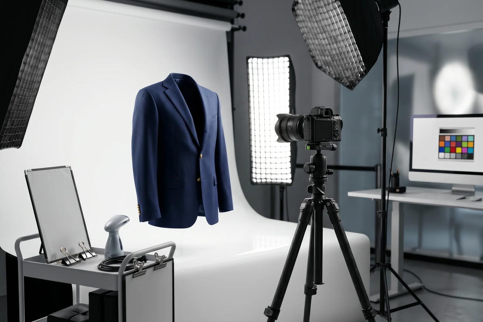
[Visual suggestion: brand standard board showing fixed crop, pose, background, and retouching rules for multiple apparel categories]
Build category specific standards
A catalog wide standard is useful, but category level nuance matters too. Dresses may need different pose logic than denim. Tops may need a slightly different crop than outerwear. Some products rely more on movement. Others rely on front facing clarity. Standardization works best when it respects these realities instead of forcing one exact template onto every garment.
The answer is usually a tiered system. One set of global rules governs lighting, overall framing discipline, and background logic. Then each product family gets a small number of tailored standards that account for what shoppers need to understand in that category.
This keeps the site consistent without becoming rigid.
Choose what stays fixed and what can vary
Every strong visual system distinguishes between fixed variables and flexible variables. Fixed variables may include crop logic, baseline lighting, default background style, and a core set of model or mannequin presentation rules. Flexible variables may include channel specific background scenes, a small range of approved poses, or a broader set of model choices within the same brand world.
This distinction matters because not every inconsistency is bad. Some variety makes the catalog feel alive. The problem comes when the wrong variables are left loose. If crop and lighting drift wildly, the site feels unstable. If brand consistent model choice or scene treatment changes within a controlled range, the site can still feel coherent.
The job is not to eliminate variation. It is to put variation in the right places.
Review the catalog as a set, not image by image
One reason inconsistency survives for so long is that many teams review assets one at a time. An image can look perfectly acceptable by itself and still create problems when placed beside twenty others. That is why standardization work requires set review. Look at category grids. Compare new products to older ones. Check whether the visual rhythm holds across page templates and device sizes.
This kind of review often exposes issues much faster. A crop that felt fine in isolation may look obviously too tight once the grid is visible. A new background may look elegant on its own but feel disruptive when mixed into a quiet product family.
Catalog quality lives in relationship, not only in the single frame.
Standardize source images to protect future flexibility
The need for standardization has expanded because source images now support more than one end use. A product photo may later feed new model imagery, alternate backgrounds, social crops, or refreshed creative. If the original source is inconsistent, every downstream use becomes more complicated.
This is why standardization should begin earlier than many teams think. It is not only about the final PDP image. It is about the raw material behind the full image system. A stable source library gives the brand more flexibility later. An unstable source library forces more manual correction and more debate.
Use templates, not endless exceptions
A common failure mode is allowing exceptions to accumulate until they become the real standard. One product gets a special crop. Another gets a different pose because it looked better in review. Another gets a scene background because the campaign team liked it. Over time the image system stops being a system.
Templates are the antidote. Not rigid sameness, but approved patterns. A few pose templates. A few crop templates. A few background lanes. A few category rules. When a new product arrives, the team works from those templates first instead of improvising from scratch.
That change alone can remove a great deal of noise from the process.
Document the standard where people actually work
Many standardization projects fail because the rules live in one long deck nobody opens after the kickoff. The standard should live where the team already makes decisions. It can be a short operating doc, a visual reference board, or a tightly organized guide inside the production workflow. The important thing is access and clarity.
Make the examples concrete. Show the approved crop range. Show what a strong source image looks like. Show what counts as an acceptable background. Show the difference between a commerce pose and a social pose. People follow standards much more reliably when they can compare against real examples instead of abstract language.
This is especially important when several teams touch the same image library. Photography, merchandising, creative, and growth do not all speak the same way. A shared visual reference closes that gap.
Why standardization helps small teams most
Large brands sometimes survive inconsistency because they have enough volume, staff, and paid traffic to absorb the inefficiency. Smaller brands usually cannot. Every mismatch costs more because there are fewer people to correct it and fewer assets to balance it out. A small team with a strong image system often looks more premium than a larger team with a loose one.
That is why standardization is not only for enterprise catalog operations. It may matter even more for a growing label trying to look trustworthy with limited resources.
If your team is using UNSTILL or similar workflows to extend content from existing source images, consistency becomes even more valuable. The getting started guide and asset review guide both support that broader systems approach.
Standardization should still leave room for hierarchy
Not every product deserves the same level of visual treatment, and a good standard acknowledges that. Your core commerce lane should be the most stable. Priority launches and hero products can receive richer versions that still stay recognizably inside the same system. Social and campaign assets can push further when the channel justifies it.
This kind of hierarchy is healthy. It lets the catalog stay coherent while giving the brand room to create emphasis where emphasis belongs. Without that hierarchy, teams often either over standardize until everything feels flat or under standardize until every page feels improvised.
The practical conclusion
To standardize apparel product images well, you do not need a bloated style manual. You need a few clear visual rules, category aware templates, disciplined set review, and a shared understanding of which choices are fixed and which are flexible. When brands get that right, the catalog becomes easier to scan, easier to trust, and easier to grow.
That is the real payoff. Standardization is not about removing personality. It is about building a stable visual language that lets personality show up in the right places, without forcing every new product to reinvent the rules. If you want to apply that logic to mixed legacy assets right away, how to keep product images consistent without reshooting every SKU shows how to do it with the files many teams already have. Use Unstill to test that standard on one category before you roll it across the full catalog.